Practical Data Solutions
Revised Slogan
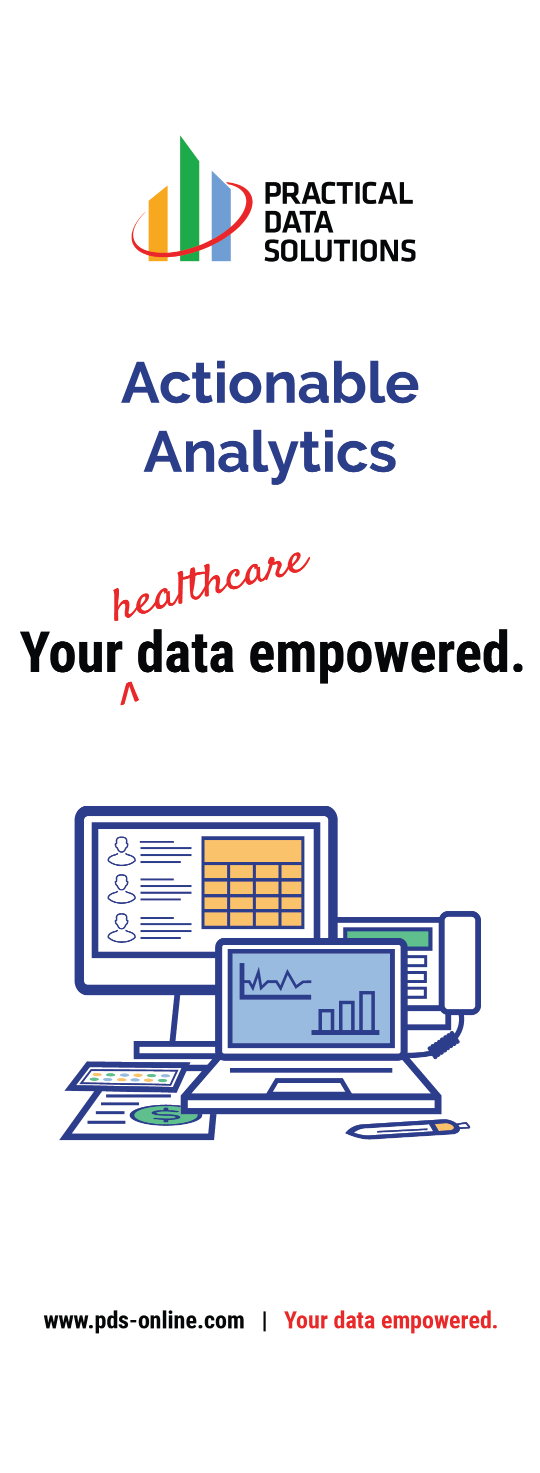
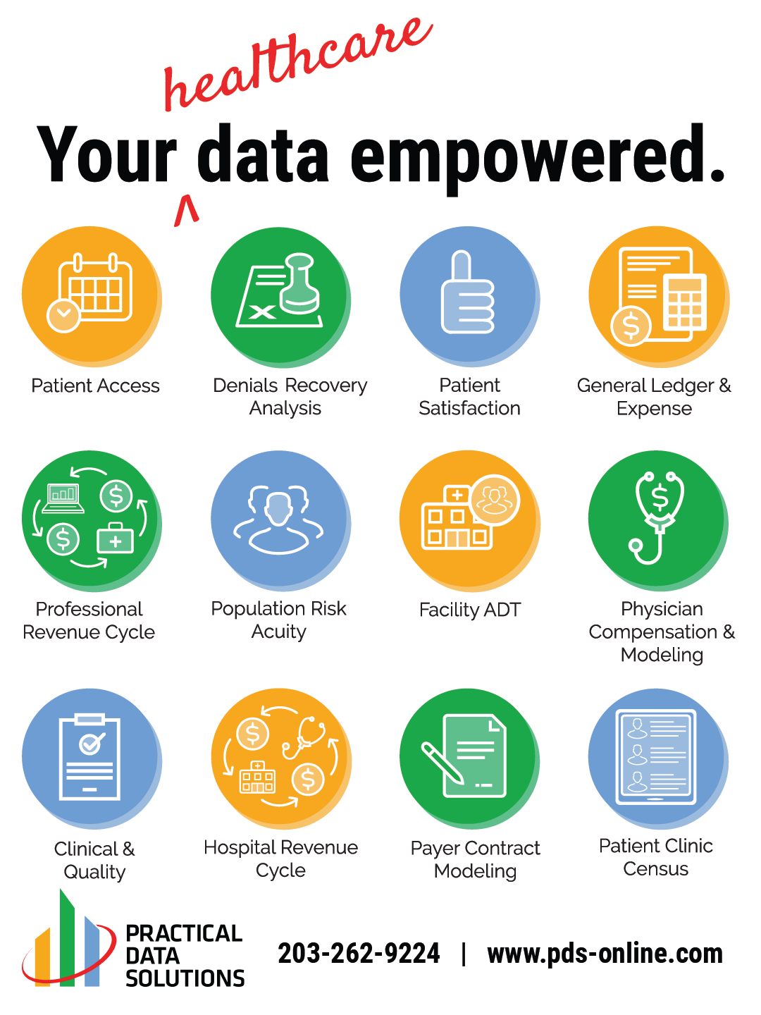
This simple postcard design was a revision on the company’s slogan “your data empowered.” The word “healthcare” was added in the red accent color to emphasize the goal of providing resources for healthcare organizations.
The color palette, previously established in the company logo, was used to create all the graphic material. Additionally, lighter versions of each color were used to create depth, with their darker counterpart working as a shadow. Red was used primarily as an accent color, while dark blue was used to outline graphics.
Icons for Website, Print, and Promotional Material Use
Practical Data Solutions had a few graphics created by another designer that they wanted to continue to utilize. My goal was to create additional graphics within this previously defined style:
These icons were created to represent different services and benefits that Practical Data Solutions offers their clients. The style was kept simple and clean, with repeating elements to unify the symbols. Each icon could be displayed in one of three ways, shown below. These options allowed the icons to be used throughout all graphic design materials without changing their meaning.
Icons in order from left to right: Population Risk Acuity, Healthcare Analytics, Physician Comp, Patient Access, Payer Contract Modeling, Patient Clinic Census, Denials Analysis Recovery, Patient Satisfaction, General Ledger, Clinical Quality, Facility ADT, Visualization Dashboarding Tools, Hospital Revenue Cycle, Professional Revenue Cycle, and Data Modeling.
Dashboard Icons
These icons were designed to match the style of the web icons and were created in two versions. Each icon was created within a circle, and on its own, as well as created in all three main color options. This allows for the icons to have extended use through the variety of looks and colors while maintaining the same symbol throughout.
Icons in order from left to right: Patients, Physicians, Charges, Denied Charges, Payments, Refunds, Denials, Schedule, Appointments, Patient Satisfaction, Office Visits, Work RVUs, Charge Lag, Next Available, Arrived Appointments, No Show Rate, Appointment Lag, CPT, Appeals, Credit, Days in AR, Clean Claim Rate, Contractual Adjustment, Patient Appointment Ratio, Surgery Procedures, Office Visits, Current AR, Payments After Denials, and Claim Edits.
Show Layouts: Booth Shades and Other Printed Material
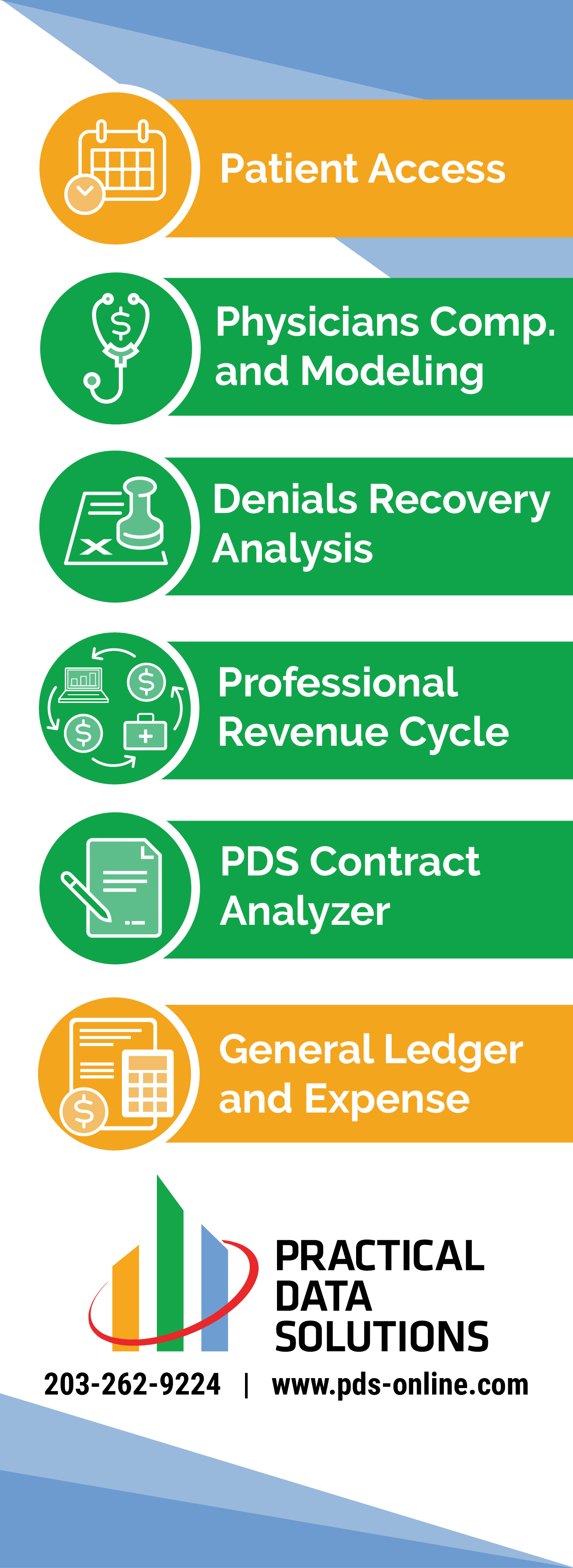
I had the opportunity to work on elements to be displayed at several venues. The materials were displayed at the company’s booth as a way to promote the services they offer. Each element was made to draw attention to the booth while maintaining the overall style created with previous graphics.
I designed three different booth shades and converted them to a print document in the desired dimensions for the vendor. Below is an image of the final designs, printed and displayed in the office.
Column wrap
Glass panel display
Floor cling
Table top display
Floor cling
Homepage Icons
These graphics were created to update the images previously displayed on the website homepage. I created versions of the images in the common style used throughout the graphics. The icons supplemented the text describing the roles of the company and how many years they have been in business.
PowerPoint Template and Style Guide
Graphics were designed for the tile of each slide. I created a set of guidelines for color use based on the meaning of each icon. Those graphics can be found in the style guide PDF.
Click here to view the template PDF. Click here to view the style guide PDF.
Additional graphics were designed to be used in the PowerPoint slides. Many of the graphics used recurring symbols from the website.
Dashboard users
Analytical intensity graphics
Super Dash character
Sick/injured characters
Doctors and patients

