Pollinator Products
Primary Logo
The goal for this logo was to create something unique, organic, and centered around the honey bee and the clover. The bee and clover were both hand drawn elements and were stylized to simplify the complex shapes. The hexagons and black outline created a modern look while keeping the overall feeling of the logo organic and natural.
Secondary Logo
This version of the logo was created as a horizontal and rectangular option that could be used in any number of designs.
Label Icons
These icons were created for use on the Nearly Nectar™ label. Each was designed in the same style as the logo. The hexagon motif is repeated here as well as the hand drawn elements.
Nutrition Based in Science
Brood Rearing
Egg-laying
Colony Health
Stimulates Flight Muscles
Experience Creating Honey Bee Products
Label Design
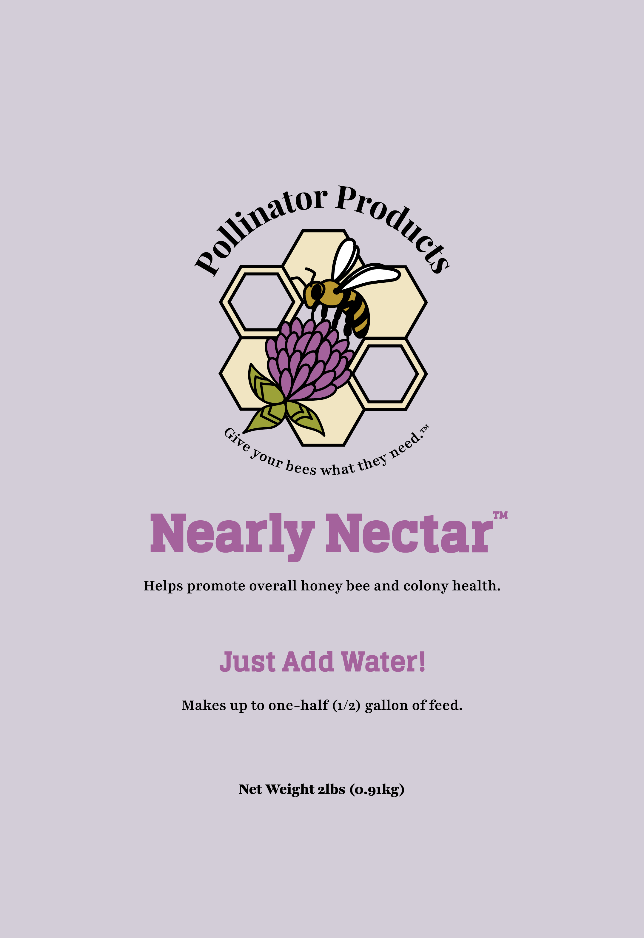
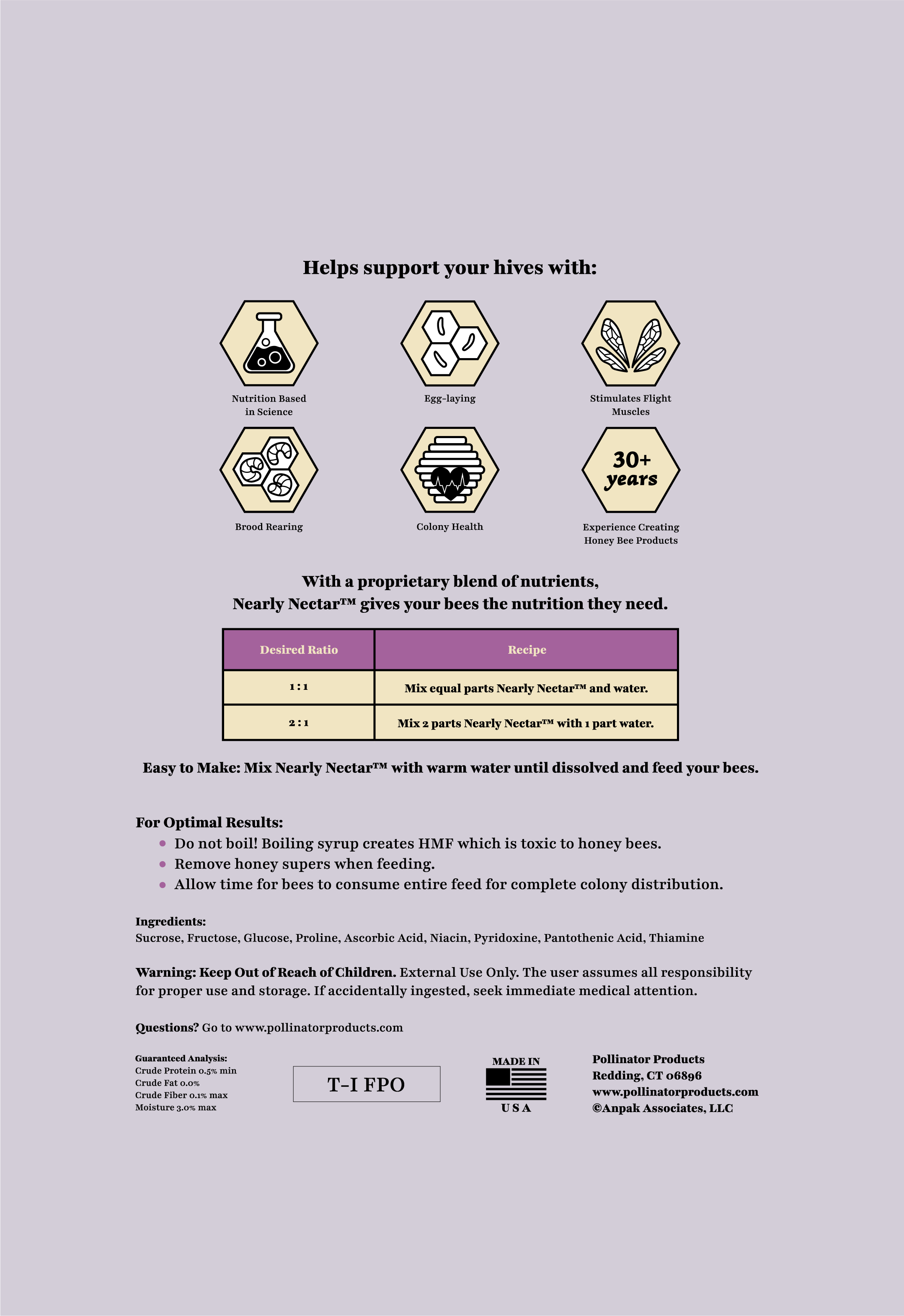
Below is the finished label for the Nearly Nectar™ product. The overall design was created to compliment the Pollinator Products logo, and fit within the color scheme created for the company’s branding. The font used for the “Nearly Nectar™” and “Just Add Water” text was chosen to pair with the logo type. The design of the font was altered slightly, to customize the type for the Pollinator Product brand.
Front of the label
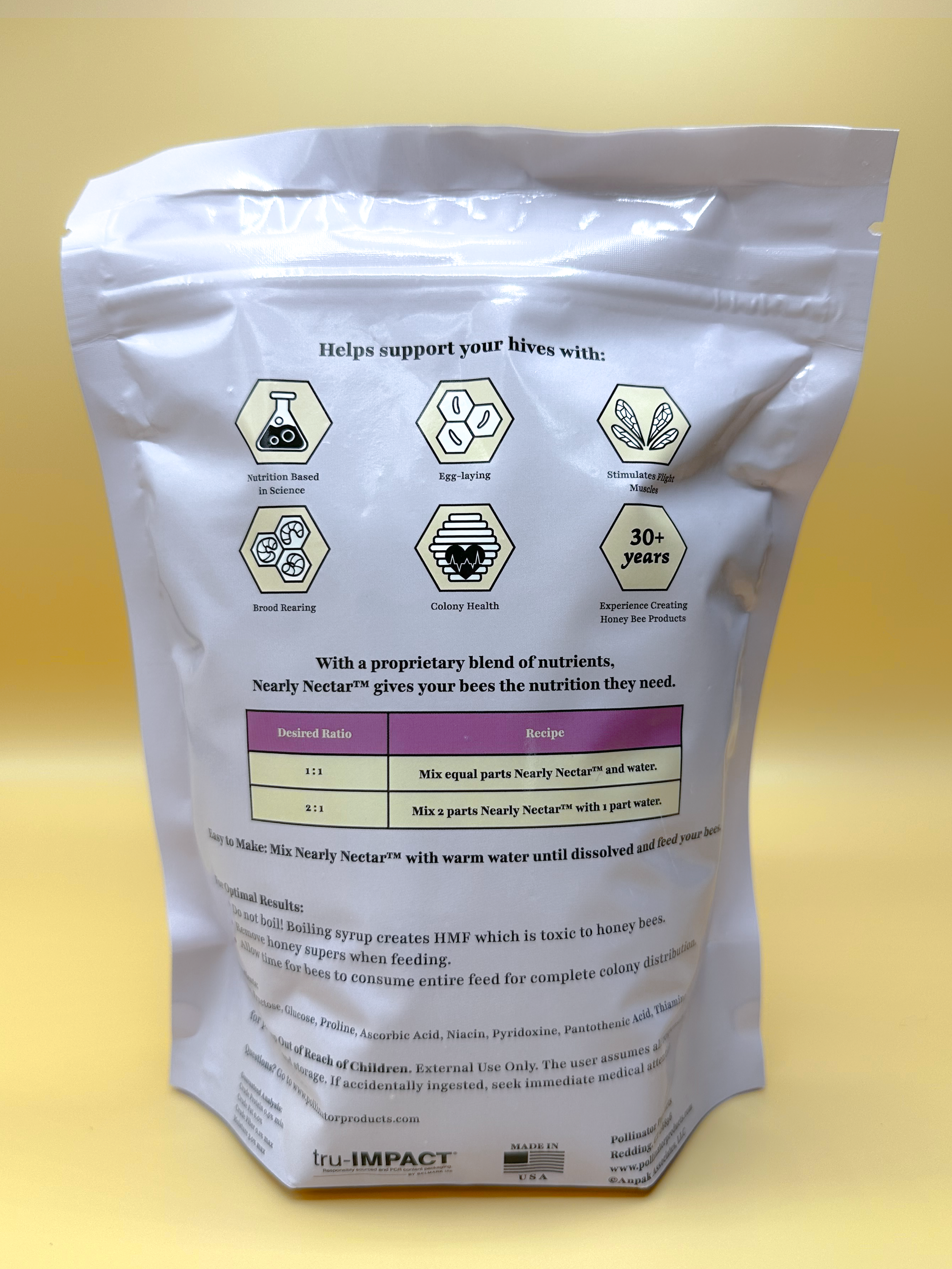
Final product photos
Back of the label


