2 Market Media
2 Market Media clients seek design services for their media brands and businesses. They often look for promotional graphics, presentations, and video editing, among other projects. It is then up to the designers to make their visions come to life, often utilizing previous branding. Featured below are some of the projects that I have completed for various clients of 2 Market Media.
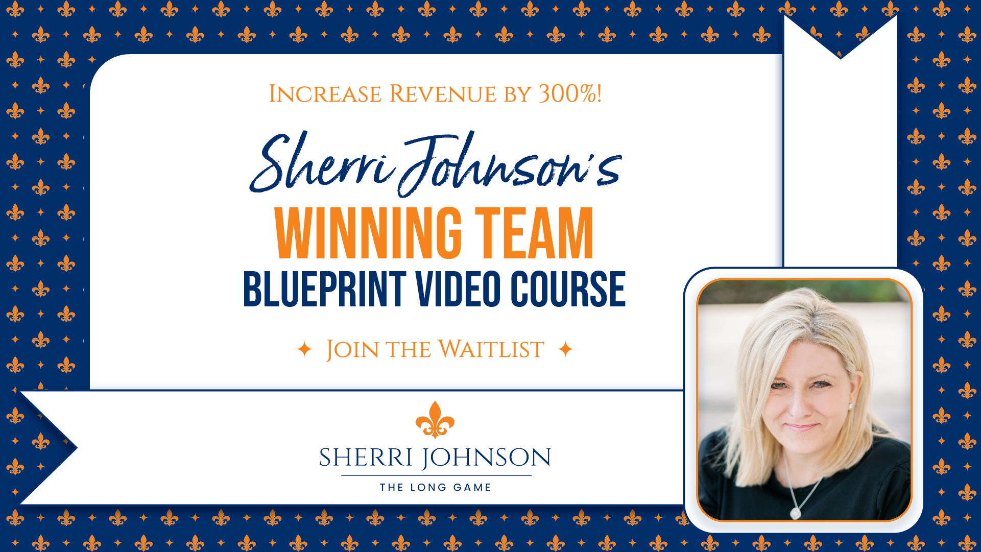
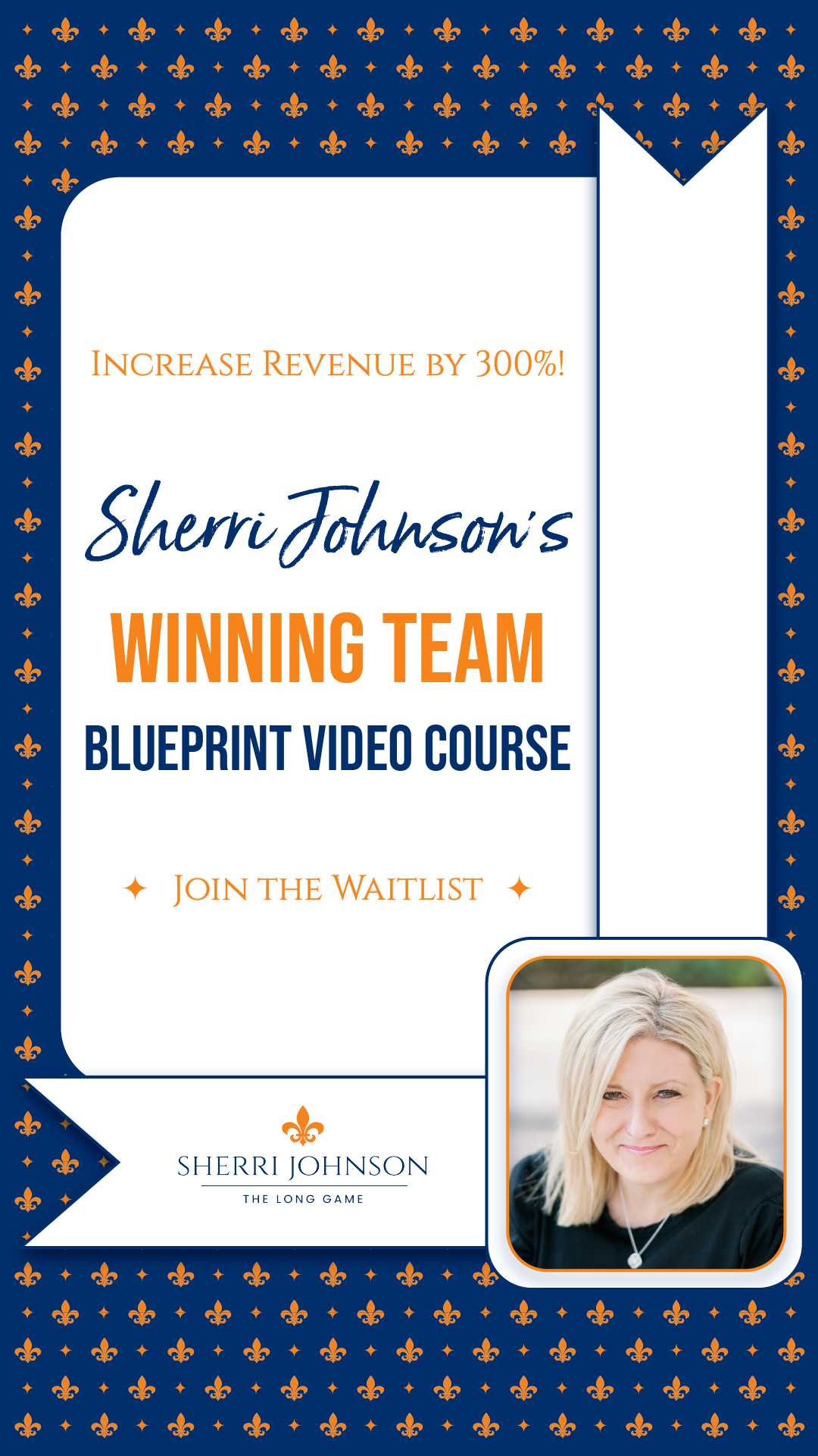
For this project I created three sets of graphics for the client to promote her video course. Each graphic used her established branding, including the colors, fonts, and logos seen below. I created a repeating pattern using her logomark to make up the background of two of the graphics. I then used a ribbon motif and drop shadow to create a clean, elegant look on each iteration.
The three 1200x1200 graphics were created first, in Illustrator, and once approved, resized to a horizontal and vertical version with the same designs.
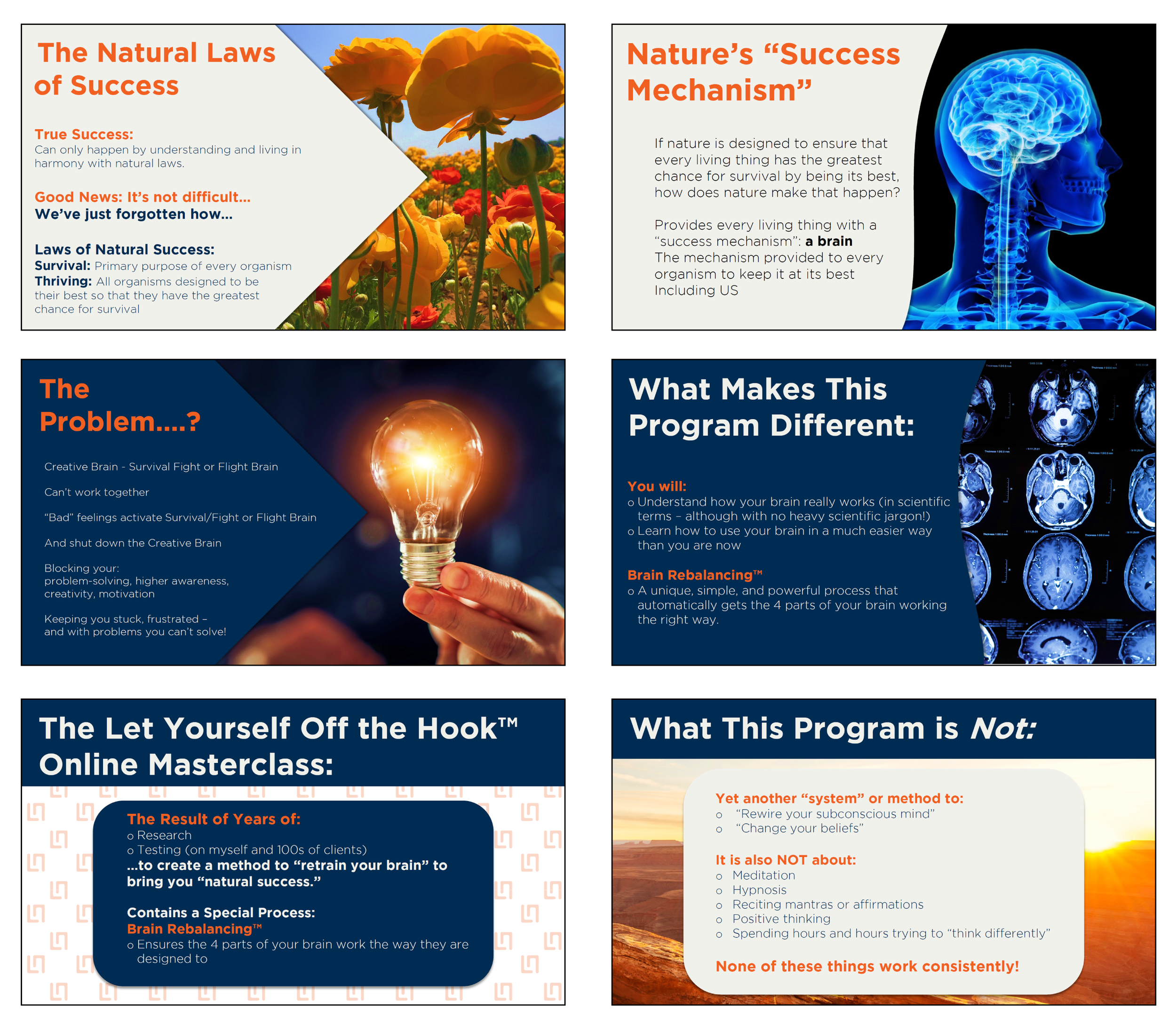
Below are a few of the slides in the presentation made for client Liam Naden’s webinar. The goal of the presentation was to market his masterclass. His previously established branding guided the overall look of the project. I created several template design styles that I rotated through, depending on the information contained on that specific slide. Each image used was selected based on subject matter and color scheme. I used images that were either primarily blue, orange, or white to create additional intent and a cohesive look throughout the presentation. The project was mainly created using PowerPoint with some additional graphics made in Illustrator.
Client Michelle Curran requested a set of worksheets, organized by module, that could be combined into a full workbook. Using her branding I created the 43 page workbook that she could then sell to her clients. Below is an example of the cover page used at the beginning of a new module, a few title pages for categories within several modules, and additional sheets showing information as well as spaces for users to type their answers directly into the document. The entire project was designed and created in InDesign.
Note: Filler text has been used to replace the content of her course.
Below are three promotional graphics for client Sam Sells. He wanted the stock images to reflect connection and community while using his new logo and color scheme. His vision was for bright, eye-catching graphics to attract his audience. Each graphic was created in Illustrator.
Client Corey Chosky was interested in social media graphics to promote his coaching program. He was looking for designs that were sleek and modern, with imagery related to real estate with the name of the program/business being the largest text on each design. I made sure to use colors and fonts from his branding with one iteration of his logomark in each design. The photographs were edited in Photoshop and the completed graphic was created in Illustrator.


